|
|
Gregory Vanderpol |
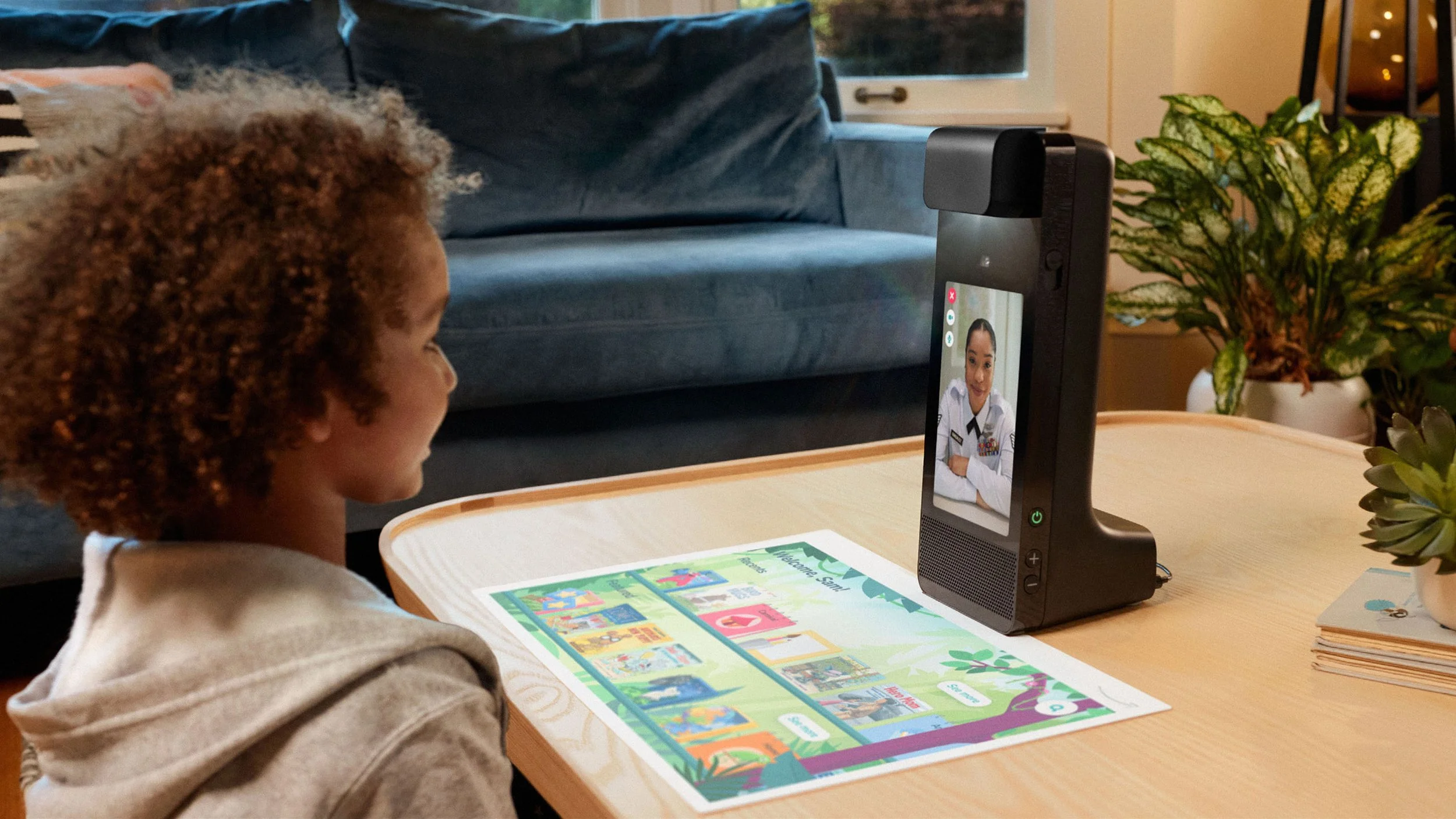
Amazon Glow was an interactive projector designed to create more meaningful connections between children and their remote loved ones. Focused on shared activities, including learning, play and creative endeavors, Glow delivered a unique experience within a walled garden of content and experiences.
The first generation Amazon Glow was incubated in Amazon’s Grand Challenge, and in it’s EVT phase when I joined – upon launching in October 2022, Glow received and maintained the highest star rating on Amazon.com for any first generation Amazon product (this rating has since dropped after the device was discontinued).
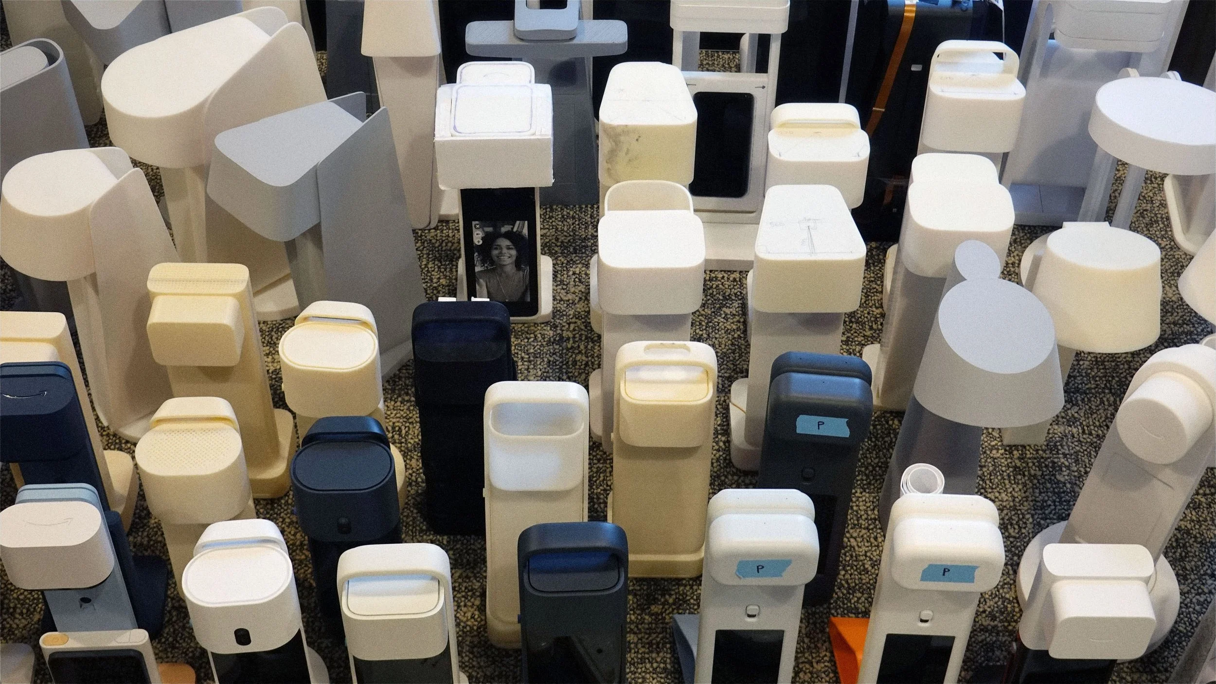
Even prior to the V1 Glow’s launch, I began work on the V2 device. The design exploration emphasized in-home mobility and optimized sizing. These and other tenets informed by customer research and reviews were developed and used to help communicate and align on ID with leadership and other stakeholders.
The 2nd generation device was designed to take significant cost out of the product while maintaining a parity experience. This was accomplished by maintaining the 20” playspace while reducing the scale of the rest of the product as well as through cost efficiencies in other areas of the BOM (SoC, cameras, etc). The form ultimately refined many of the elements found in the first generation device and addressed significant pain points around portability, storage and handling.
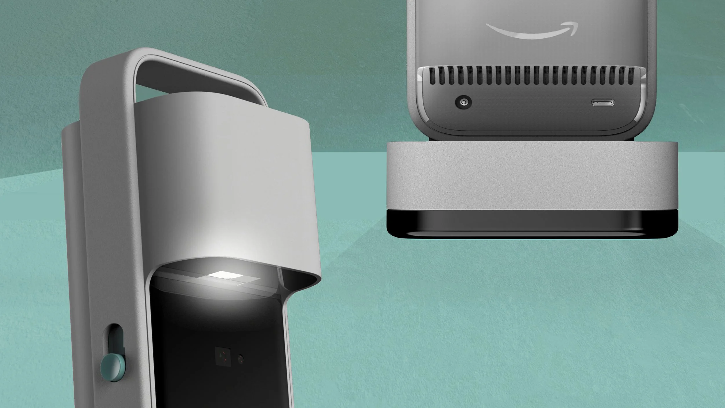
The new ID also preserved Glow’s purposeful ‘device’ strategy – an approach informed by research that reinforced a CE/tech expression rather than a toylike one.The updated ID sought to balance this approach with more playfulness and character – Inflated surfaces and softer rounds are used on high touch areas such as around the touchscreen while precise geometry and crisp edges re used on low-touch areas.
One simple improvement was the decision to inset power and accessories connectors eliminating the additional protrusion of the connector overmold from the products total depth when in use. This approach also lent itself well to a more cost optimized construction.
The updated ID also addressed a pain point found in the first generation product – playmat storage. Several directions were explored including magnetic ones, however a low tech fabric loop in combination with the platform-like base was ultimately opted for.
Touchpoints were reconsidered and included the addition of differentiated surfaces (concave/convex/flat) to help guide use by touch alone.
Touchpoints were reconsidered and included the addition of differentiated surfaces (concave/convex/flat) to help guide use by touch alone.
While working closely with engineering and other stakeholders to finalize the ID, the V2 concept was approved for production through Amazon’s ID Intent Lock stage prior to the programs disbandment.
In addition to this ID, numerous other concepts (including very different interaction paradigms) were explored. Despite being fanatically well -received by consumers, the business case for Glow proved more difficult, and after less than a year on the market Amazon made the decision to cancel the program and disband the team.
|
Amazon Glow
Amazon, 2021–2023 |
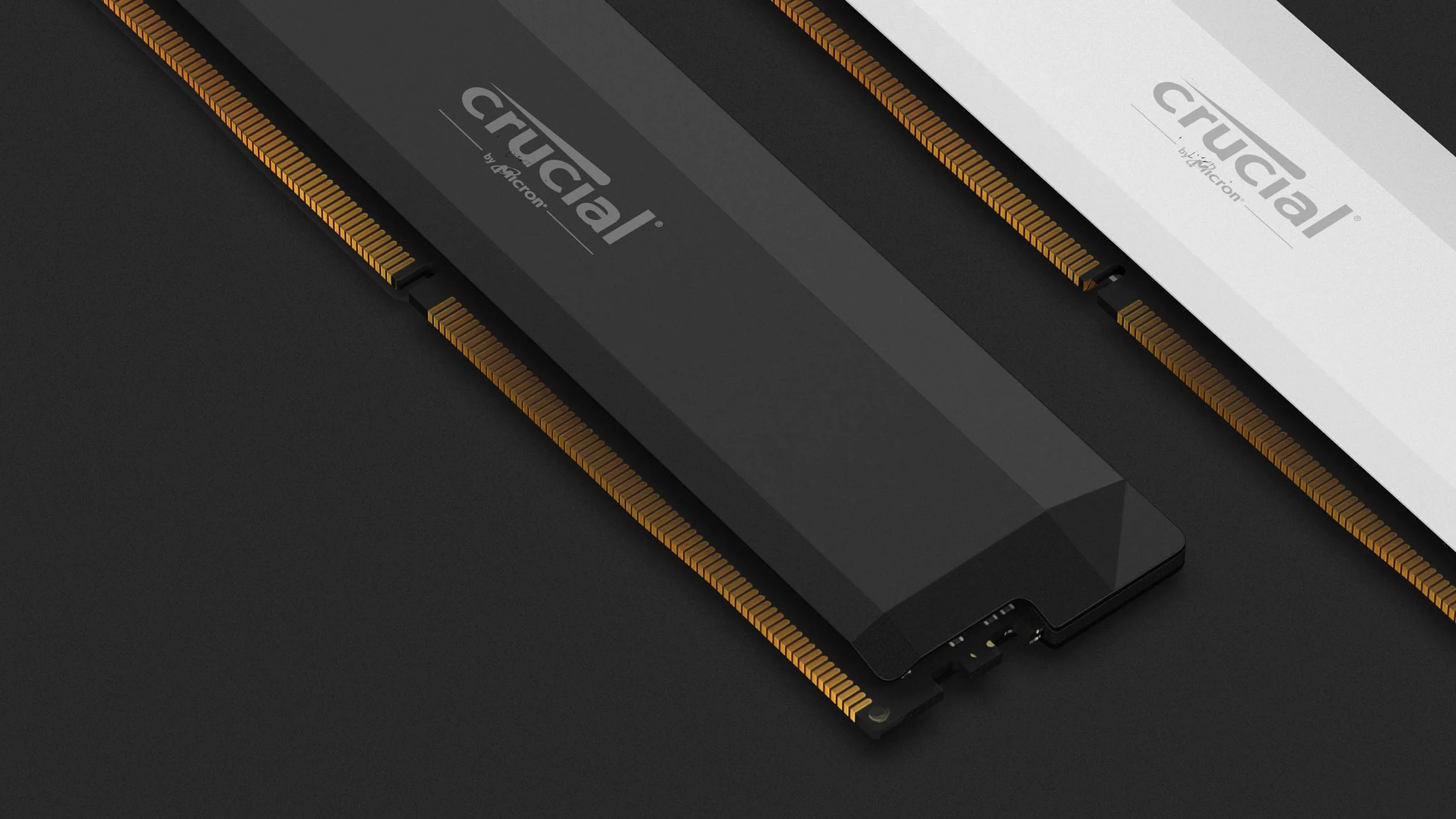
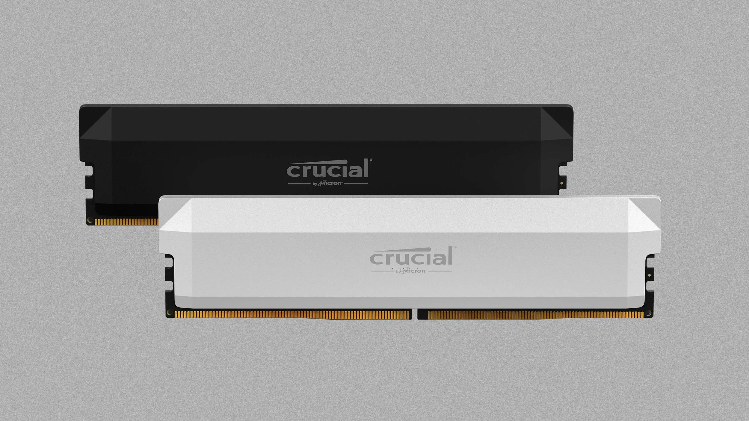
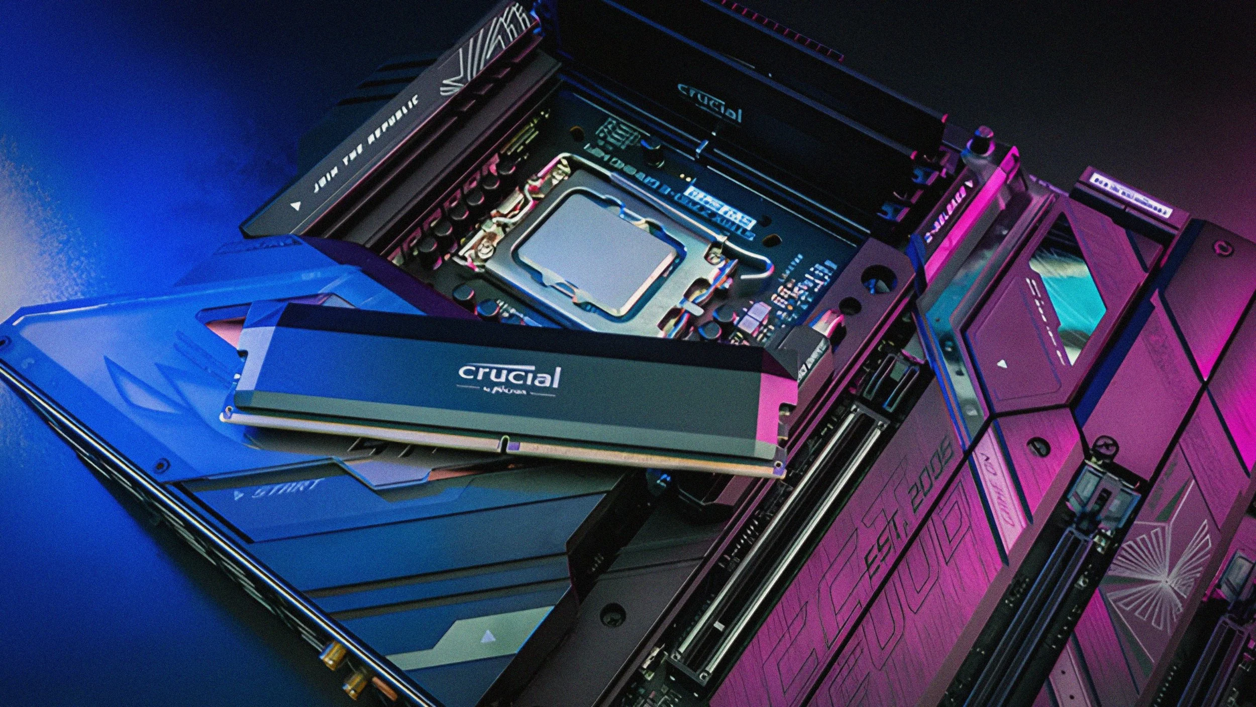
Beginning in the fall of 2023, I worked with Micron to develop a new industrial design for their next generation of performance desktop memory. As a PC component, the product consists of an existing DDR5 memory module as well as an aesthetic and functional heat spreader.
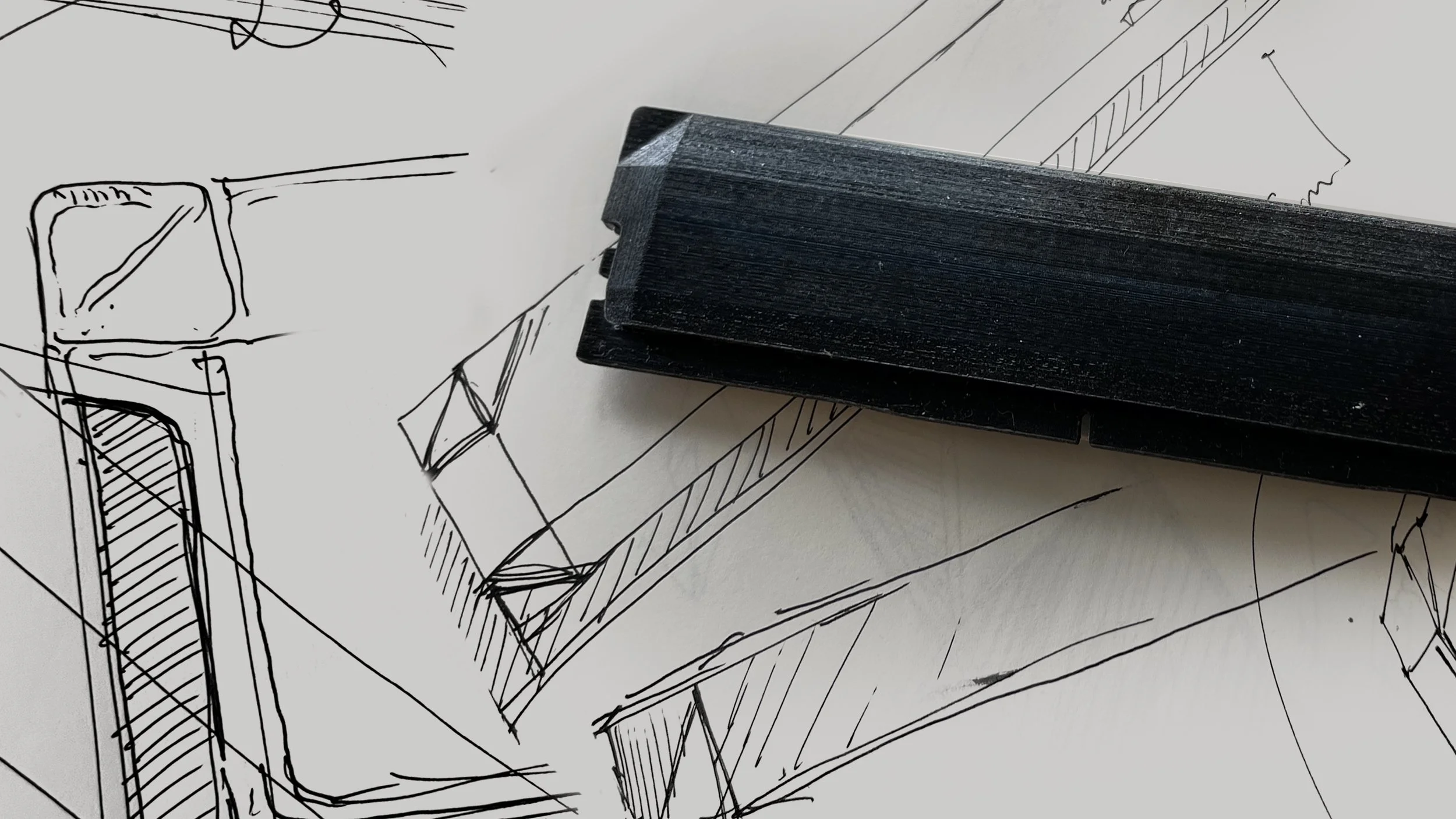
Made from sheet metal, the industrial design – Kitsune – derives it’s form in part from paper folding/origami to create an expression that appeals to a variety of users including creative professionals, gamers and hobbyist builders. The faceted design references both fashion and sci-fi/tactical elements, and as a nod to play, the design’s fox ears giving it a subversively playful undertone.
The memory modules are compatible with both Intel and AMD architectures; the low profile form is easy to install and more compact than competitors.
Although this was an expedited program I defined key aspects of the category experience and user groups and communicated potential positions through a framework that contrasted a premium technology expression against a gaming oriented one. In addition, other foundational work included competitive and analogous benchmarking as well as trend/material and process scouting.
Ultimately seven concepts were presented to the Micron team – three of these were advanced further including through a limited DFM process.
The Kitsune ID itself went through several rounds of iteration, including evaluation of different potential part and material splits. I worked closely with the contract manufacture to help evaluate varying design trade-offs.
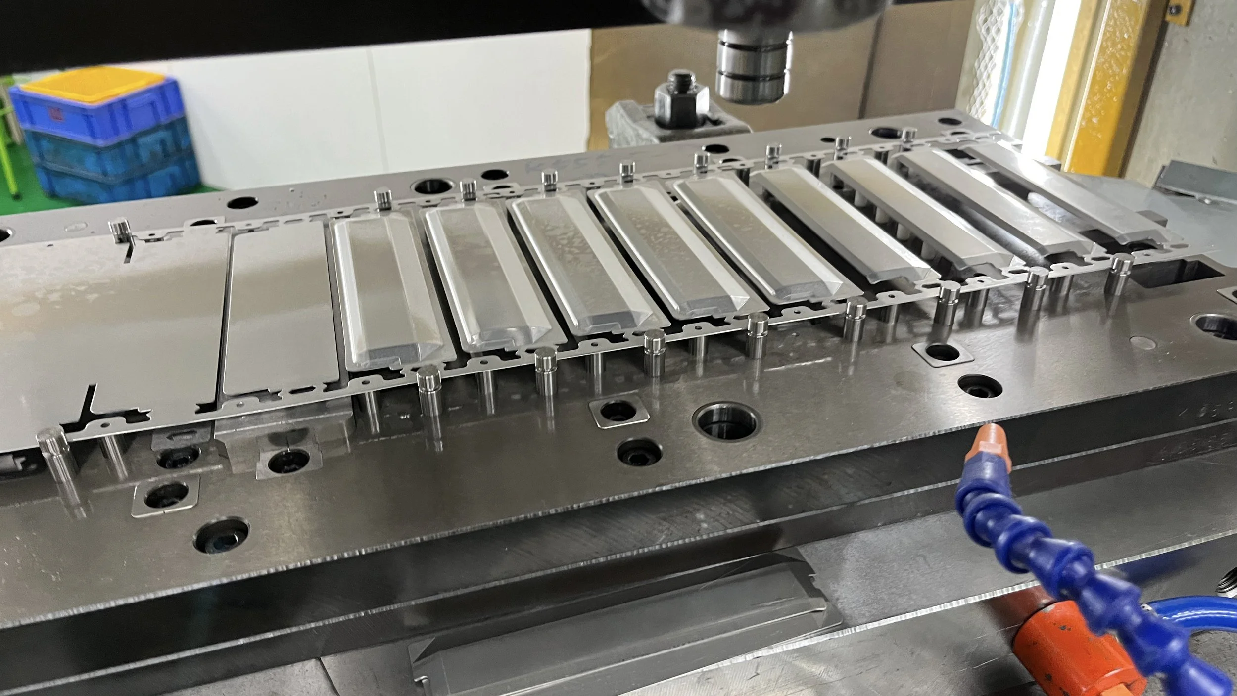
The production design features a three piece construction with a shared stamped part for the front and back and a plastic spine to hold the design together.
I worked onsite with suppliers to rapidly bring the new design to mass production, including final tool debugging and the evaluation of potential production tradeoffs, as well as to establish cosmetic and color limits.
I worked onsite with suppliers to rapidly bring the new design to mass production, including final tool debugging and the evaluation of potential production tradeoffs, as well as to establish cosmetic and color limits.
|
Crucial Pro
Freelance, 2023 |
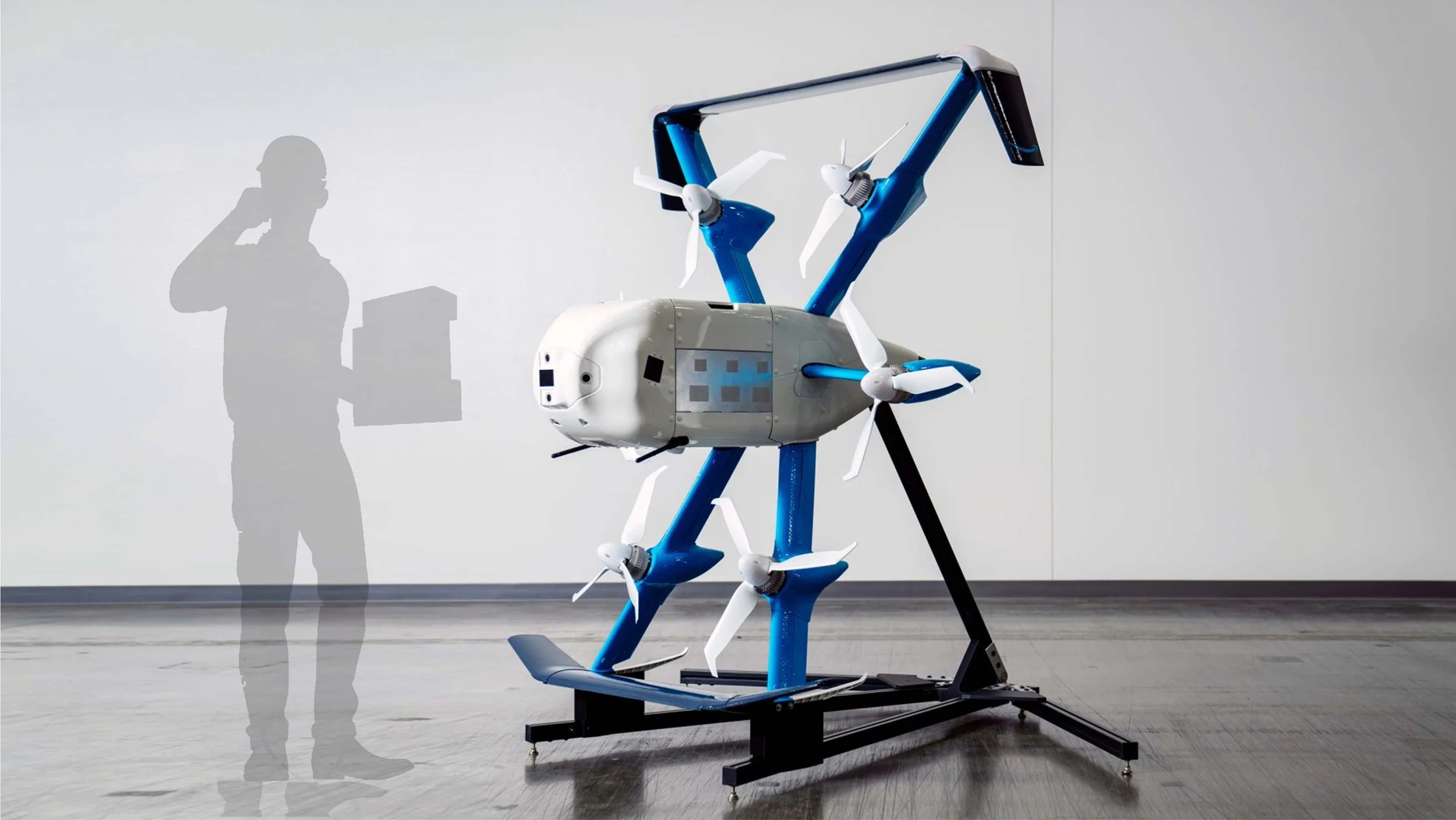
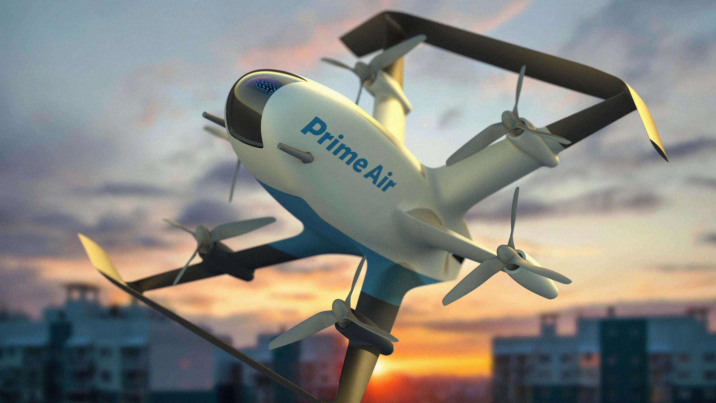
A purely speculative project, the MK-X0 delivery drone is a conceptual re-imagining of Prime Air’s MK-30 delivery drones.
For this project, the product package – including form factor and configuration – are derived from publicly available imagery of the MK-30. Proportions and component layouts are preserved but integrated into a forward looking fluidic design.
Publicly revealed in October 2023, Prime Air’s MK-30 drones are scheduled to begin delivery to customers in three U.S. locations as well as cities in Italy and the UK by the end of 2024.
Built on several earlier rounds of prototyping and iteration, the MK-30 was developed in 18 months by Prime Air’s engineering team. It represents a huge step forward in performance, with increased range, quieter operation, and improved safety features.
The MK-X0 incorporates the MK–30’s general geometry into a form that blends low resistance and sculpted surfaces.
The design features a simplified smooth front that transitions through the wings into a series of dynamic sweeping edges intended to capture a ‘wind-etched’ feel. The surfaces derive from aero forms and feature lightweight materials prominently as a celebration of the speed and capability of Prime Air.
In addition to preserving the overall dimensions / configuration of the production drone, the MK-X0 incorporates the same vertical delivery approach.
This overall design approach also lends itself well to the drones operation. The MK series take off and deliver in an upright, tilted-back orientation, while travel is performed in a more horizontal orientation.
While this project doesn’t delve into deeper usability or manufacturing issues, it demonstrates how form may be used to add efficiencies into Prime Air’s drone design. Inspirational concepting can also help a team explore scenarios, build confidence in an approach or align on competing product visions.
Further ID development would be beneficial in exploring ways to enhance the customer experience around all aspects of delivery – including consideration for the needs of various user groups including warehouse associates, service technicians and end customers.
Though the MK–X0‘s main body retains the same overall volume as the production drone, more carefully considered exterior surfaces reduces the visual impact of the mass.
Livery, including additional graphics and color elements can be used to further accentuate how the form reads or otherwise tune the expressiveness of the drone – or to better adapt to other vessels in Amazon or 3rd parties fleets.
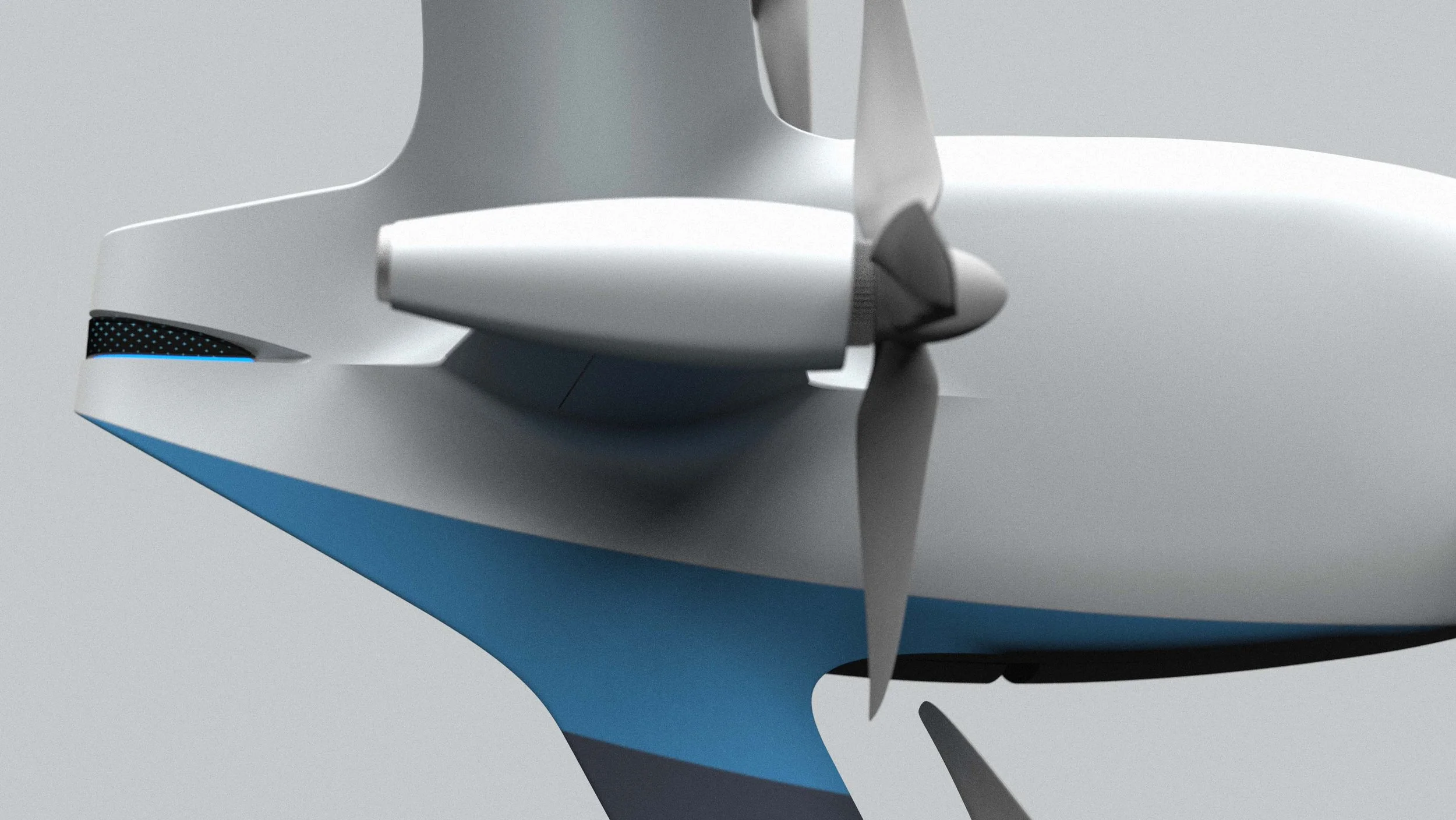
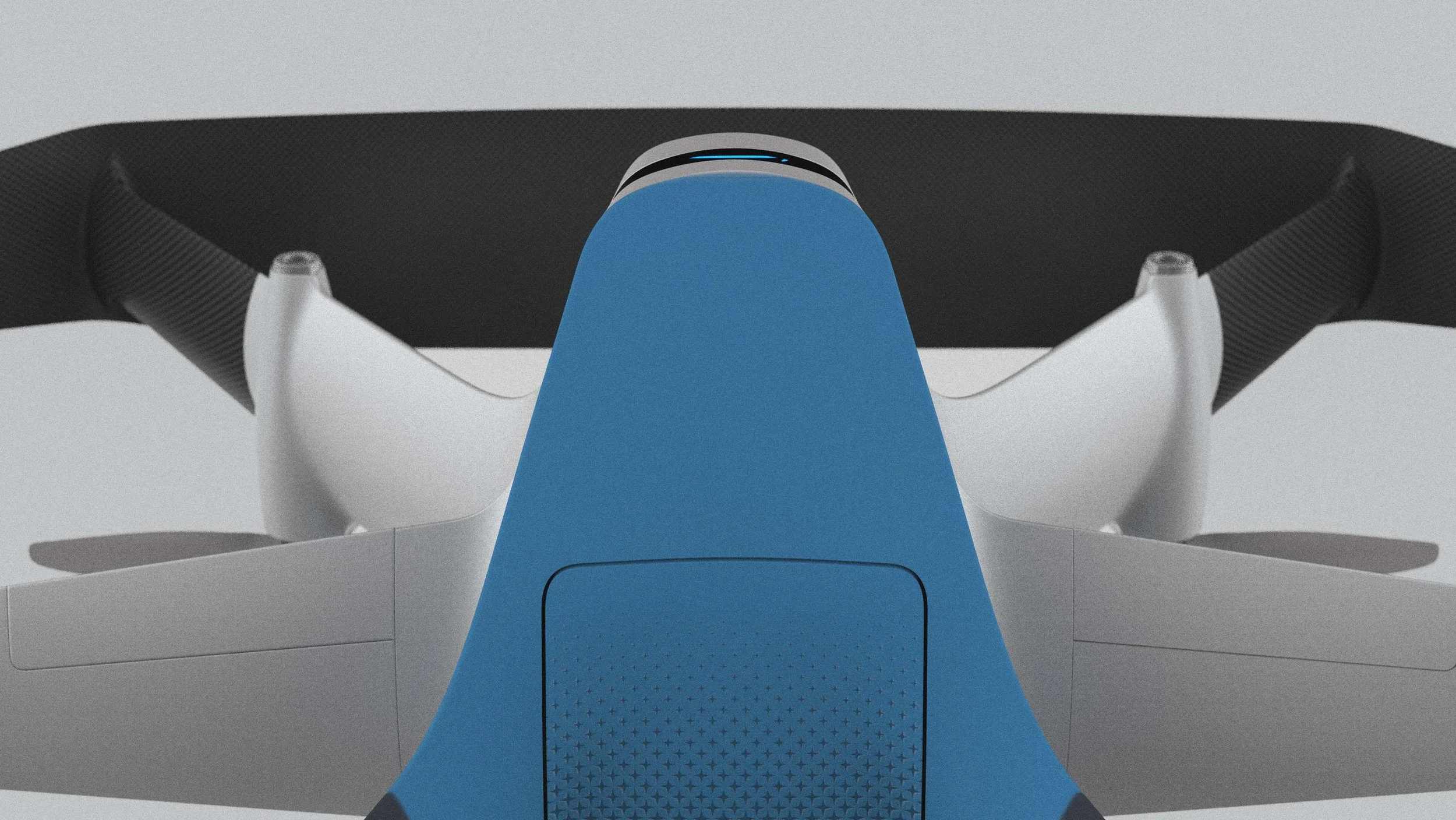
Forward facing sensors are placed behind a window in order to simplify the overall appearance and to provide a less intimidating framing for cameras and other surveillance elements. This approach –a simplified space helmet like window – can be utilized to improve drone performance by decreasing resistance / turbulence from today’s baseline design.
Visual elements beyond form, including graphics, and CMF elements can be used to indicate functionality or key component areas – such as the cargo hatch and bay – as well as to reinforce existing design elements found on other Prime Air physical and digital touchpoints.
|
MK-X0 Delivery Drone
Speculative 2024 |
|
Crucial / Micron X8, X6
WHOA, 2019–2020 |
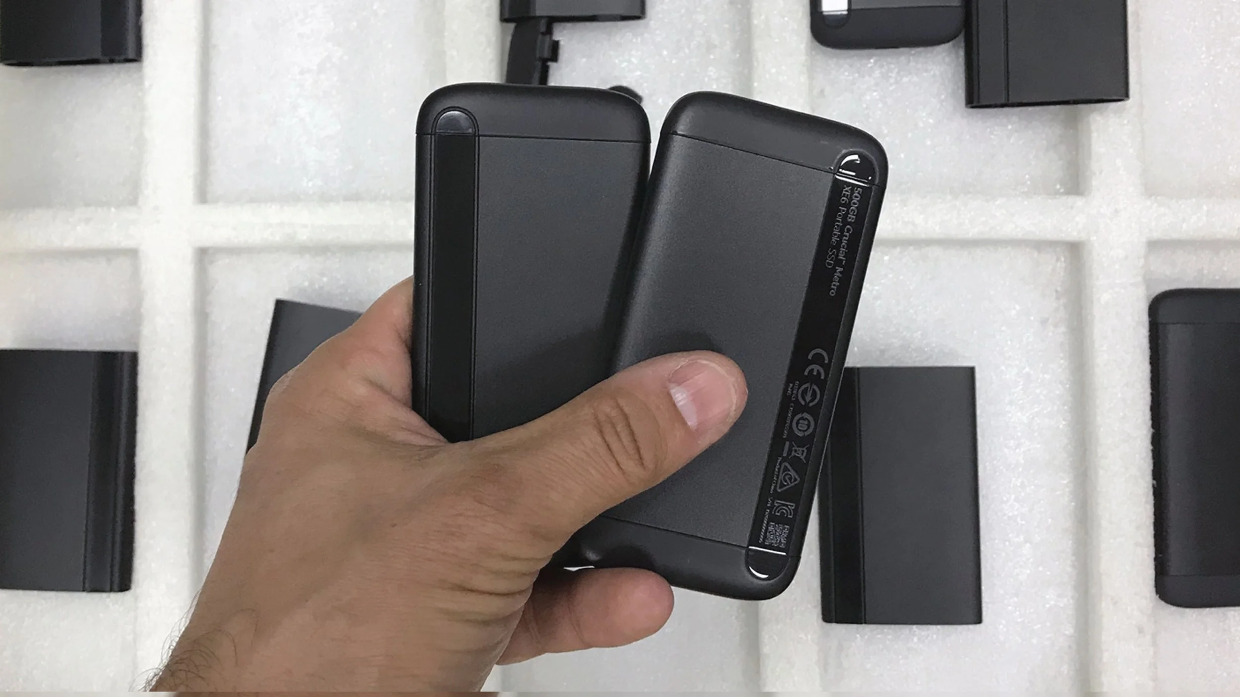
The X6 followed immediately after and was developed within a similarly ambitious time during the height of the pandemic. At present, the X6 holds 4.5☆’s with 9,000 reviews on Amazon.com, the X8 4.6☆ and 10,000 reviews.
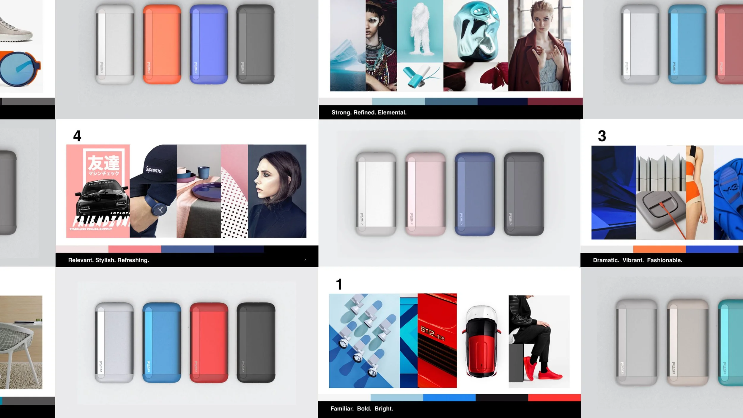
The initial foundation stage of the program involved alignment on users, performance / price point and other constraints. Importantly the decision was made at this early stage to utilize aluminum extrusion in the construction for thermal, cost and aesthetic reason.
The selected design featured a pebble like form with highly tactile surfaces featuring soft touch on the caps and a soft finish to the aluminum core. The only flat surfaces are formed where two planes intersect the form and reveal a polished interior that serves to anchor the Crucial branding.
This included CMF studies as well as explorations in a number of potential variants enabled through different secondary processes.
While lead industrial designer for portable products at WD, I worked to help develop and apply an updated design language that addressed pain-points in the prior Lumen design, while reducing costs, simplifying tooling and part complexity and evolving the design language into a less polarizing form.
My work included design and support through production on multiple products as well as leading CMF exploration’s and consumer reactions.
Designed as an introductory solid state drive with a focus on mobility, My Passport Go included a double shot TPE bumper as well as tethered cable. The visual pattern was a simplified series of grooves and the co-molding and secondary processes leveraged for easy CMF variability. It holds 4.7 with over 3,000 reviews on Amazon.com
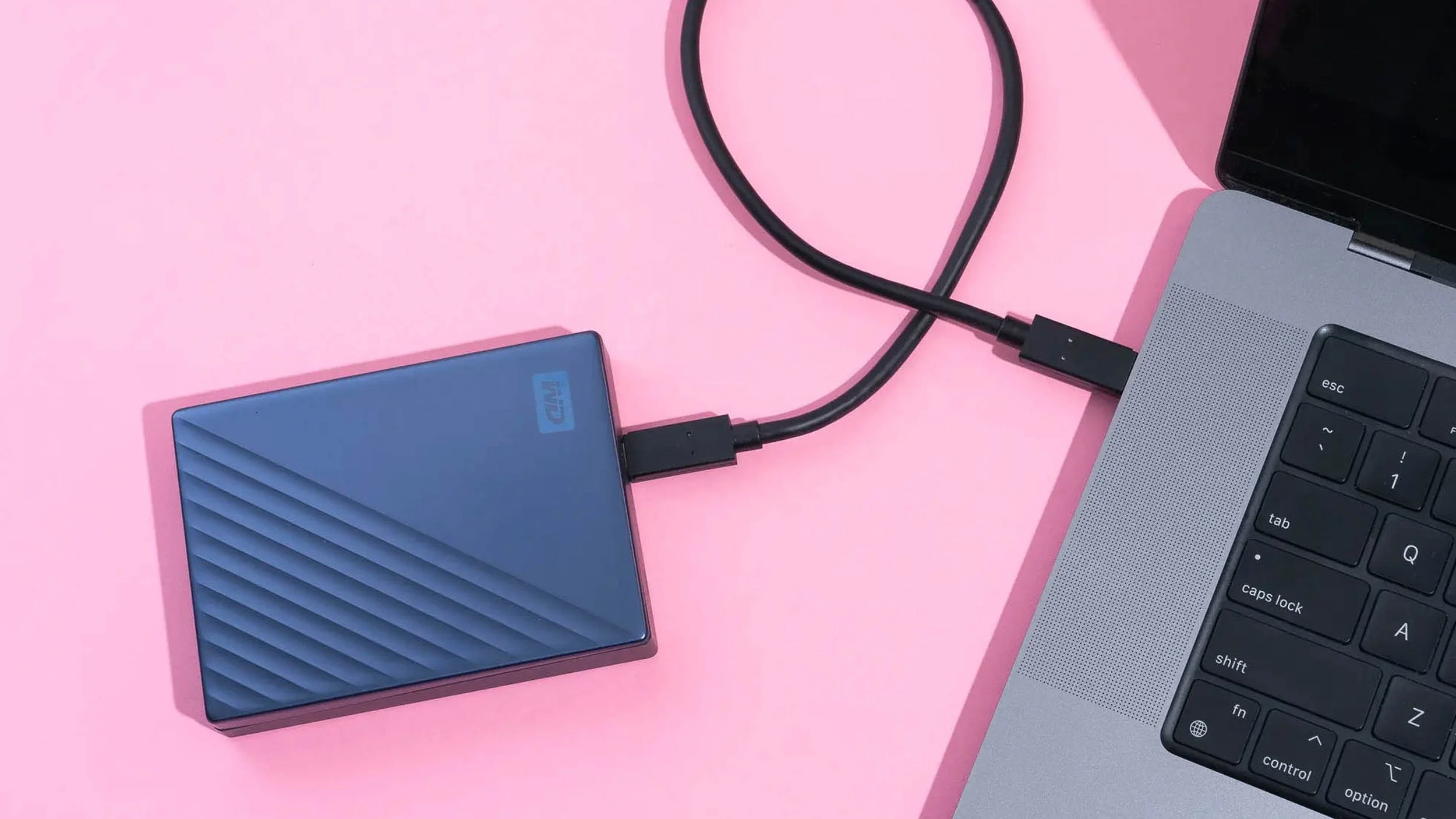
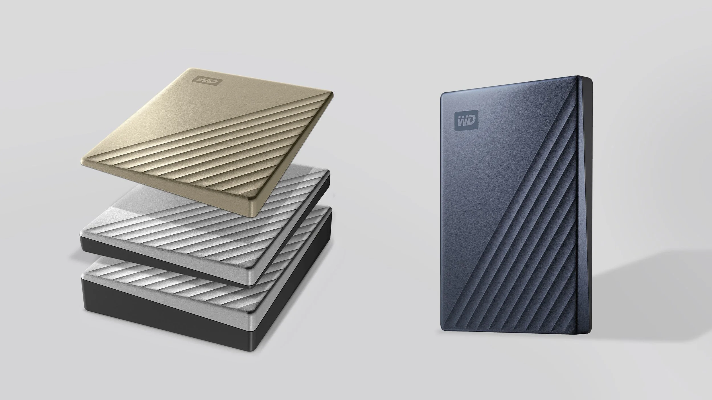
The Lumen 2.0 My Passport Ultra utilized sheet metal construction for greater CMF flexibility, optimized size and reduced costs – I supported the design through mass production.
One additional benefit of the updated design was a reduction in overall complexity through the reuse of an interchangeable cover. This greatly reduced tooling costs and massively simplified production. This generation My Passport Ultra remains on sale and currently holds 4.5 ☆’s and over 11,000 reviews on Amazon.com
|
Lumen 2 My Passport/Ultra/Go
Western Digital, 2016–2018 |
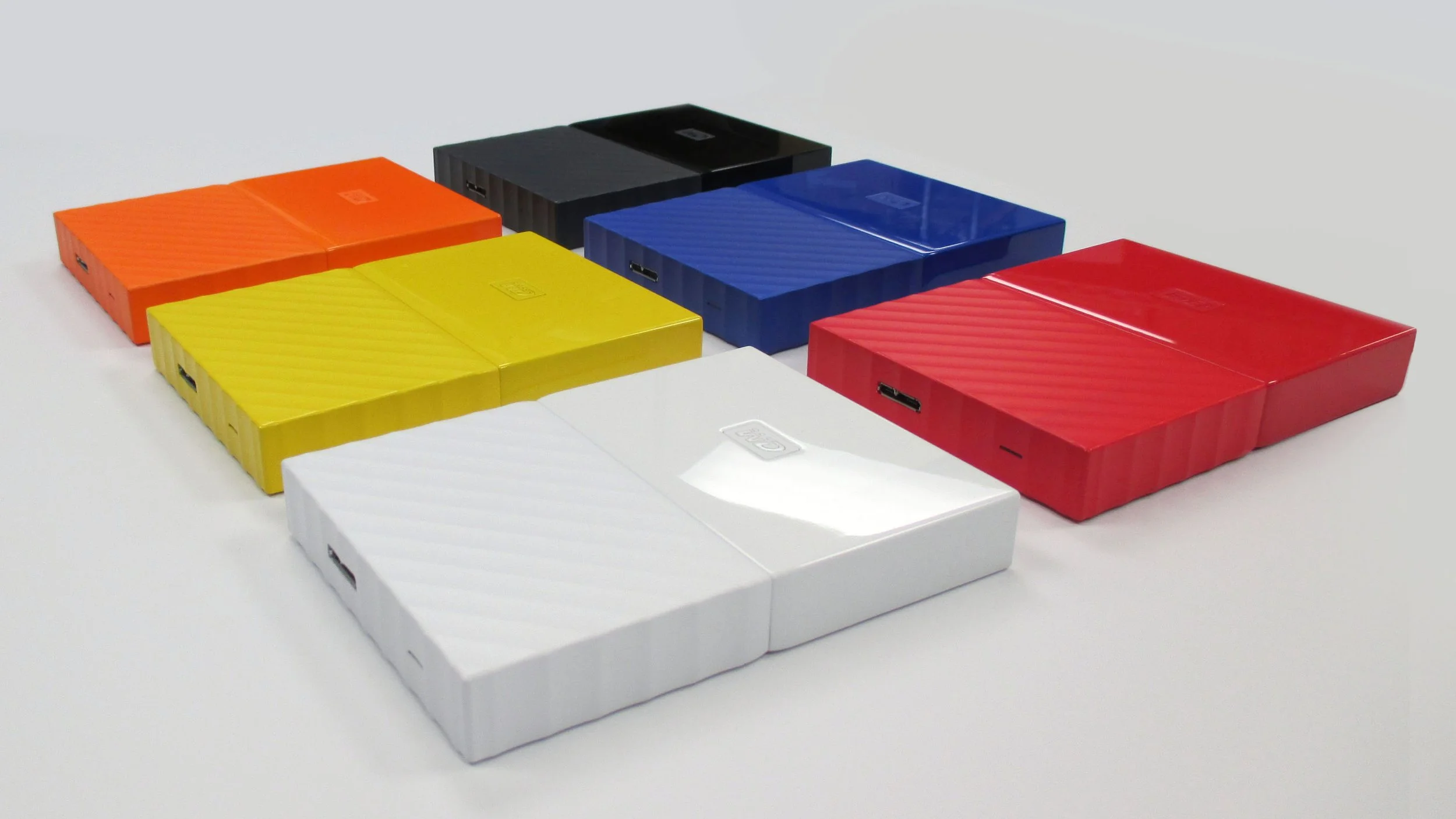
Beginning in 2014, the WD ID team developed a transformative new design language in collaboration with Fuseproject. This new design language would be deployed across a number of desktop and portable products over the course of two years beginning with our highest volume My Passport products.
As lead designer for portable products, I was responsible for the design and execution of several variants – this included extensive CMF development and the development of several different product architectures.
The Lumen design language was conceived around a center waistline with two contrasting monolithic halves. The base was intended as a beautiful, textured foundation while the top expresses a clean and minimal surface. In the original design language, the center line was intended to accommodate an integrated light as a ‘lifeline’ representing the intersection between physical and digital worlds. This addition was unfeasible for portable products for numerous reasons.
The mass market My Passport was prioritized initially. In order to execute quickly the team opted to maintain the previous generation’s bucket/cover architecture for reliability. This was inherently at odds with the design language’s split at the waist of the product. In order to overcome this challenge, a single color strategy that emphasized the split halves through texture and pattern was adopted.
PC was selected over ABS in order to provider greater strength, scratch resistance and depth of color. In addition to exploring different textures, variations on form, pattern and proportion, I was responsible for extensive CMF work through production, including extensive work with suppliers onsite through mass production.
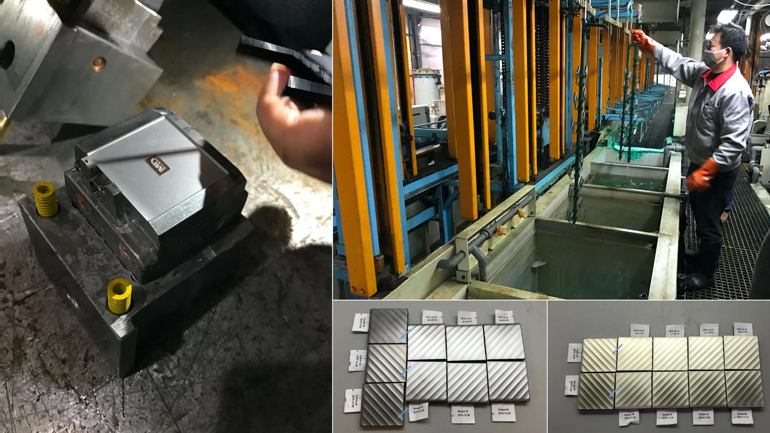
I also spent extensive time with tooling and molding houses to troubleshoot cosmetics due to demanding surface quality standards, technical challenge in executing the patterned half, zero draft design, variability with the different resin colors, and the need for part interchangeability produced by different suppliers.
As a follow up premium version of the My Passport, the Ultra variant was developed next. With a longer development runway, our engineering team developed a shock absorption system that would allow us to execute the design with a dual endcap design – allowing the execution of a dramatic split CMF.
Executing the lower half of the design in metal was also a challenge. In order to execute this, I worked extensively to scout suppliers and trial different approaches including stamped / formed, diecast, extrusion with secondary processes etc.
A similar design approach was adopted for the follow on My Passport SSD (left).
Ultimately a plating process was selected due to cost challenges with realizing the pattern in actual metal. I opted for an electroplating process to preserve the feel of metal (not present in vacuum metalized options) and worked with our supplier to develop three matte finishes including a novel nickel based ‘champagne’ gold.
The Lumen design language pushed a number of barriers – it was technically challenging and aesthetically disruptive but proved to be polarizing. In addition, some elements of the initial design vision were developed with little consideration for execution – driving additional product size and and working against user needs. This critical look at the design inspired its evolution into the current second generation version.
|
Lumen 1 My Passport/Ultra/SSD
Western Digital, 2014–2016 |
|
Zebra Printers ZD410, ZD420
RKS, 2013 |
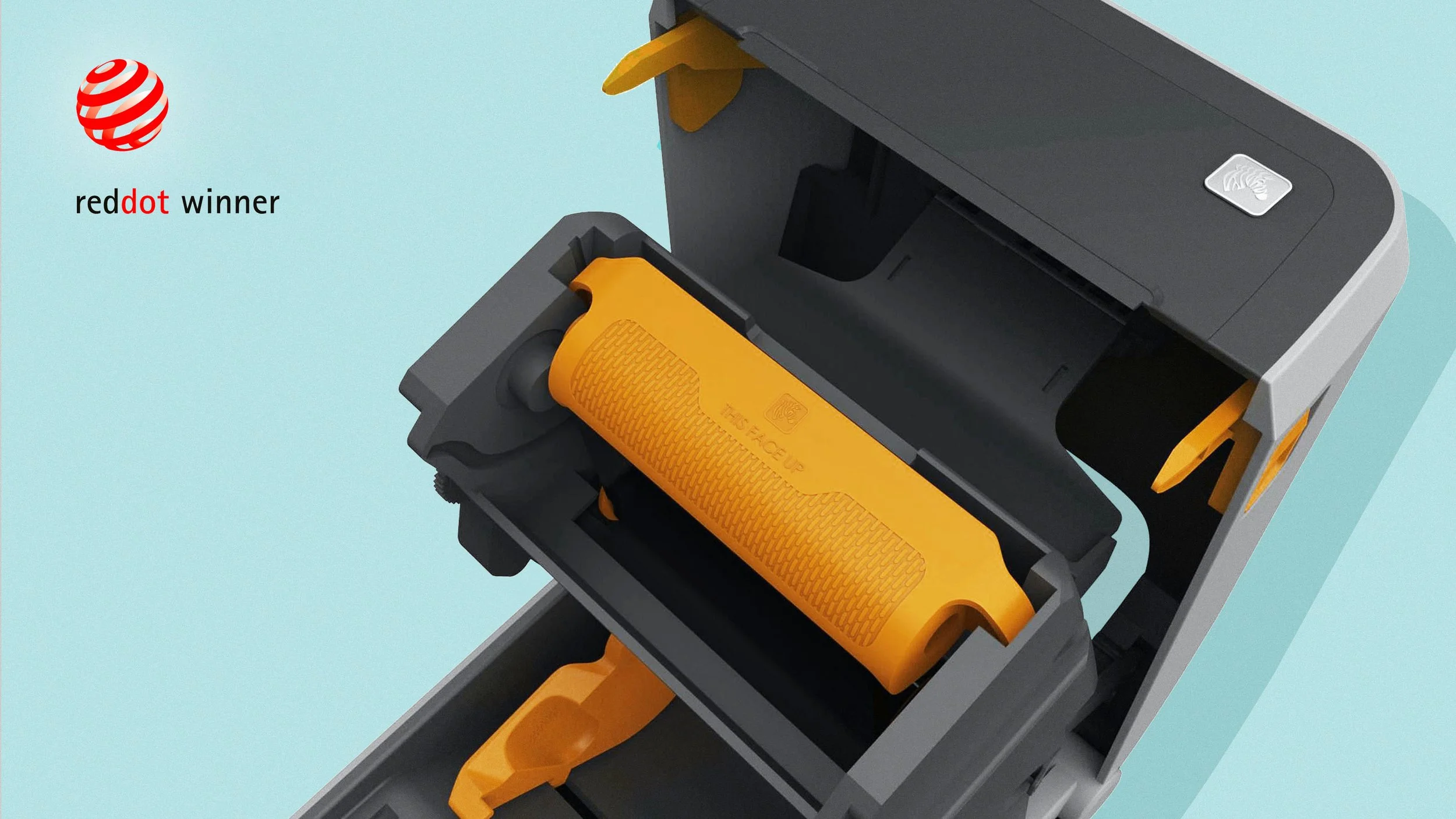
While at RKS, I was the ID lead for a redesign of Zebra’s desktop portfolio of thermal printers. This included global co-creation with a variety of vendors and users and ultimately yielded both large improvements in the user experience, design awards including the Red Dot, and significant IP that has helped Zebra maintain it’s leadership in the category.
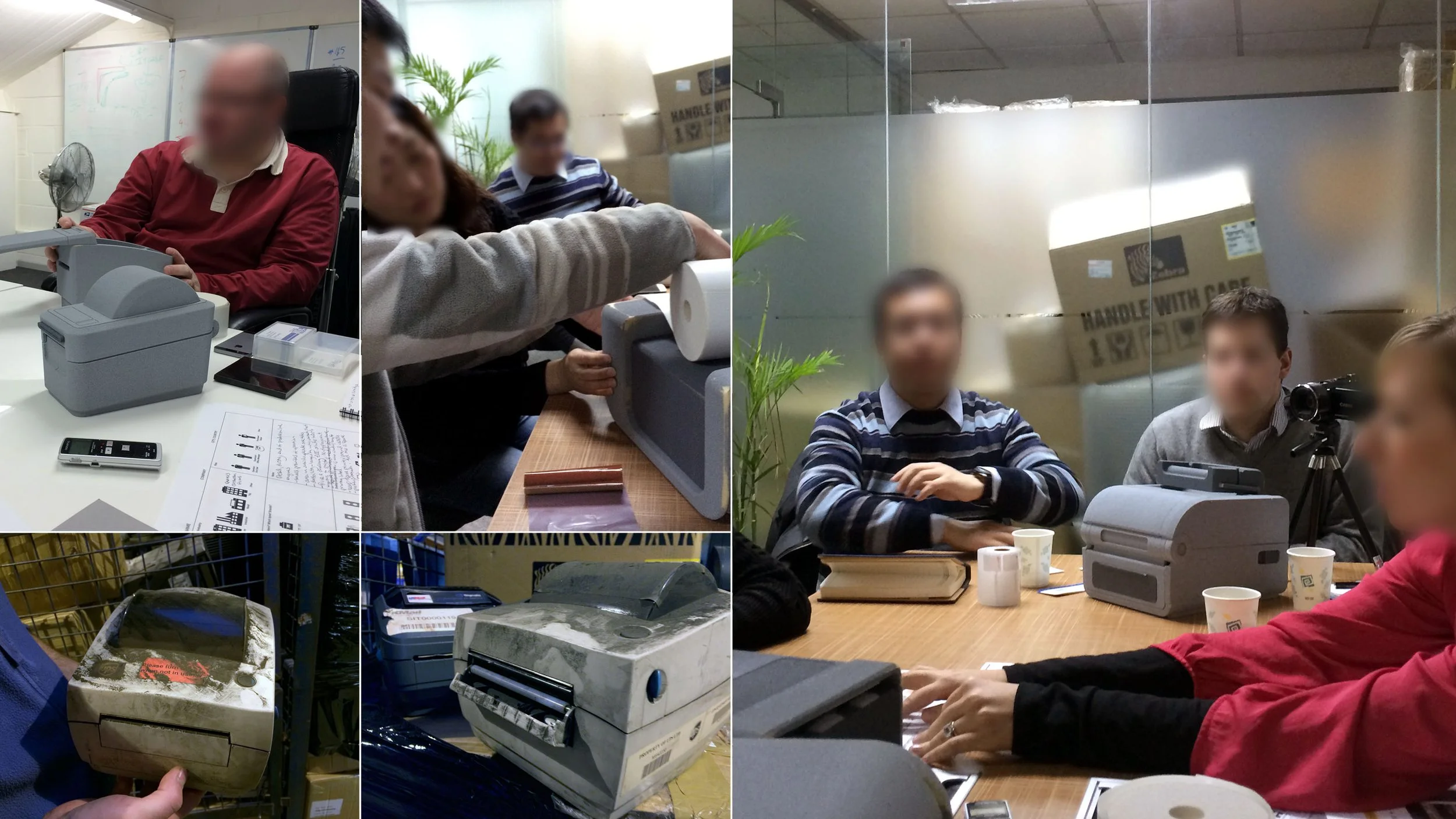
Thermal printers are used on demand in a variety of settings including shipping, transportation and logistics, healthcare and retail. These environments can feature demanding conditions and a large variety of users (with varying levels of familiarity) may need to use the devices.
Initial research included site visits to better understand usage and settings as well as extensive experience and design benchmarking of existing Zebra products as well as their competitors..
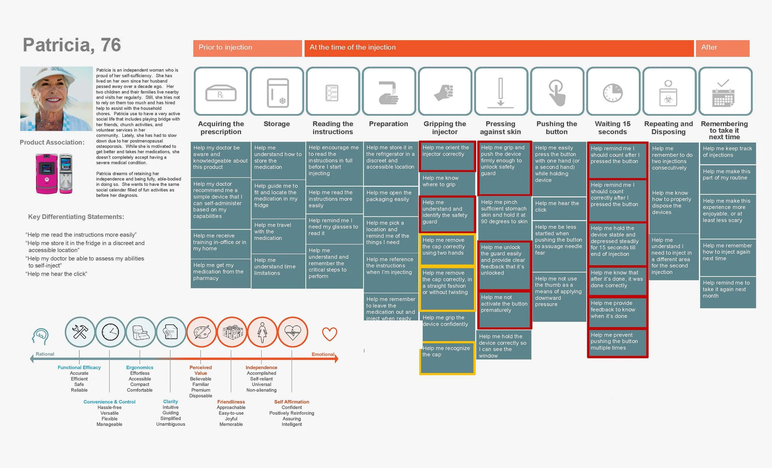
This research was assembled into several personas and user journeys. Pain points were prioritized on a user by user basis and then evaluated as a whole in order to help prioritize the key challenges that ID would seek to address.
This foundation was used as a catalyst for a cross-functional brainstorm of experiential features and architectures. In particular, the ribbon-changing experience on the more complex 4” printers was noted as a key pain point as well as the relationship between the locations of the media and ribbon in the device.
The ideas were then distilled into a series of stimuli concepts intended to explore varying functionality. This was augmented with additional paper stimuli and card sorting exercises to explore visual design language and communication.
Along with design research and client observers, I participated in a multiple market (US, UK, China) co-creative study to elicit reactions and help define the desired user experience.
The resulting ZD 410 2” direct thermal printer prioritized compactness in the design while offering improvements to touchpoints updated styling and CMF for industrial and healthcare applications.
The more complex ZD 420 also kept the shroudlike design language and emphasis on compactness while addressing several signficant user experience challenges. The device opened to a greater angle allowing easier media changes and featured an innovative ribbon cartridge system that significantly reduced reload times as well as provided zebra an additional line of recurring revenue.
|
Haier Commercial Coolers
RKS, 2014 |
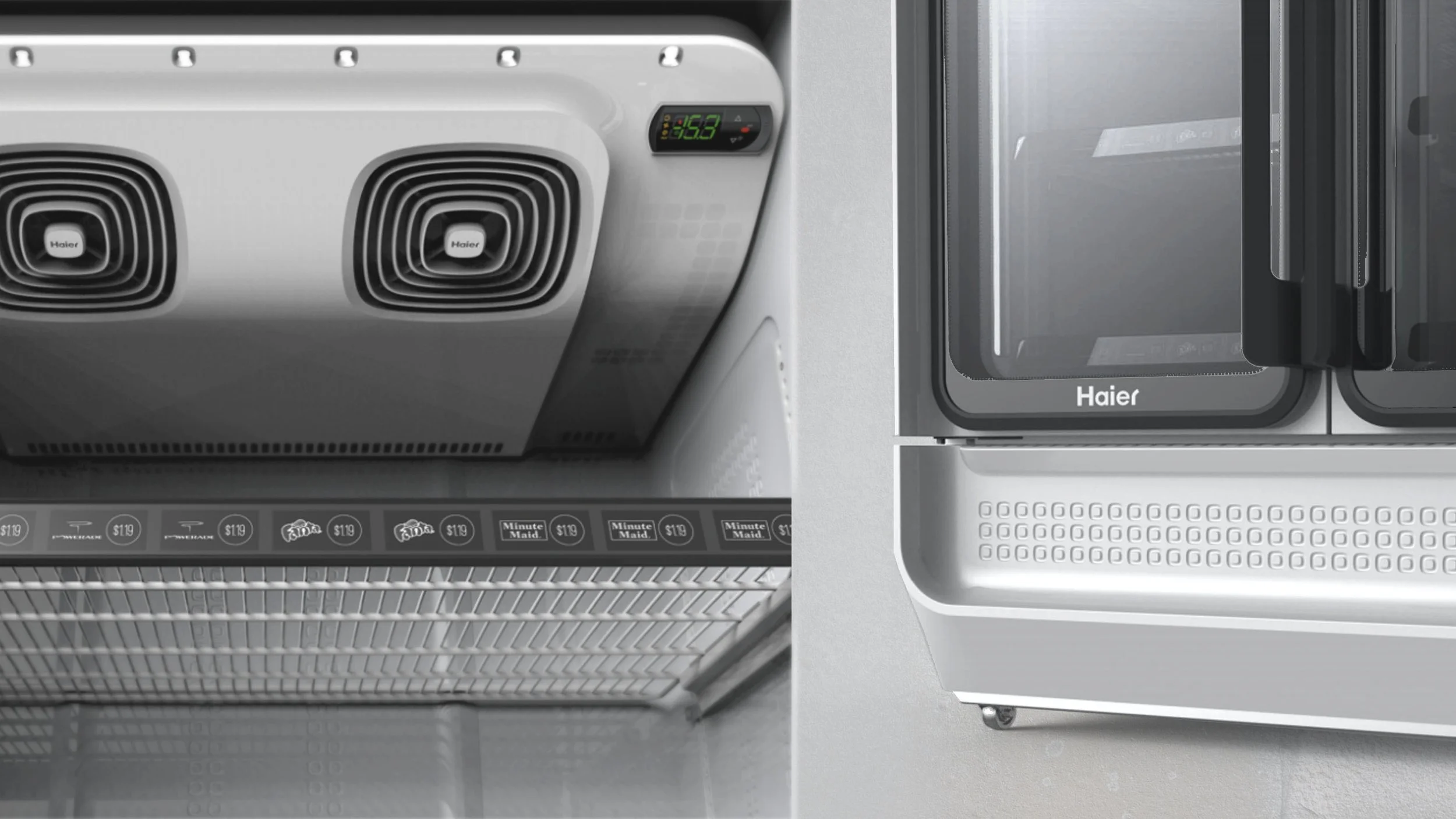
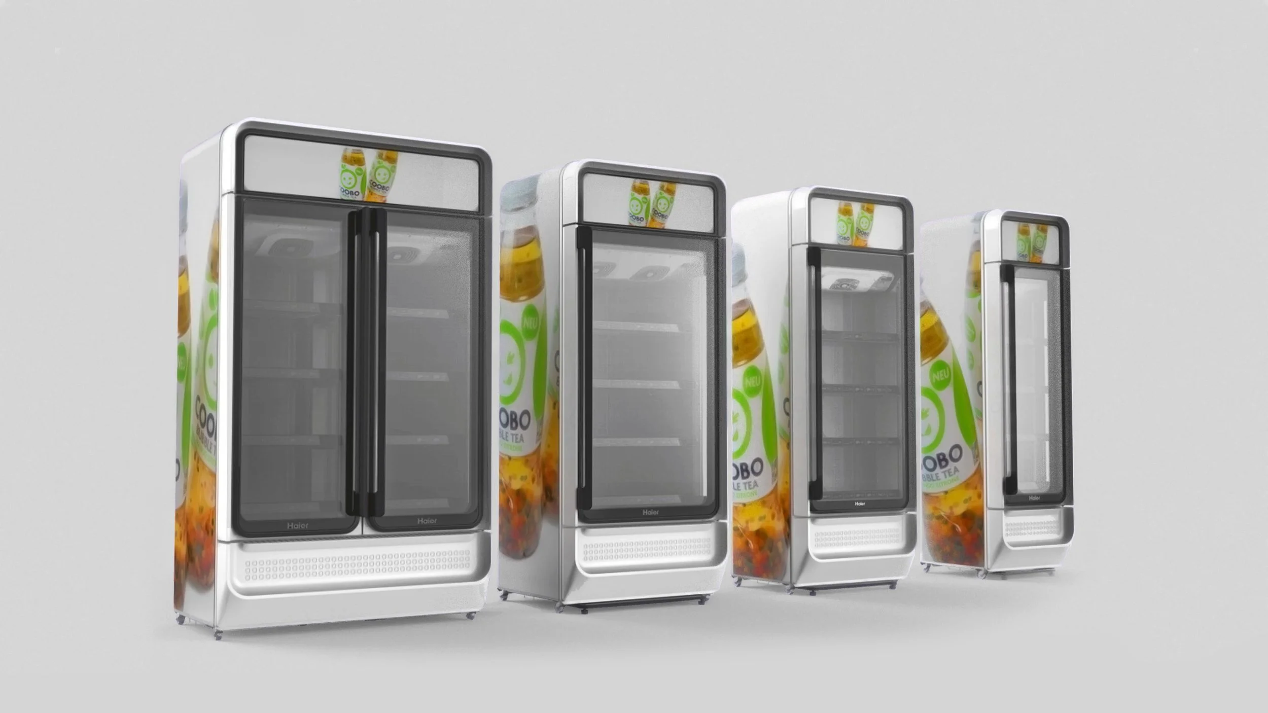
While at RKS I worked on the interior and exterior design across a wide variety of beverage cooler sizes and trims for Haier. The designs have since been integrated into a number of production coolers for the Chinese domestic market.
The initial design exploration included a tear down and analysis of existing coolers, an exploration on novel assembly methods and the identification of several key opportunity areas for design including improved accessibility for stocking and maintaining product as well as brand expression (for both Haier and advertised products).
The concept ultimately selected, Core featured an encircling design gesture. This became a template for a signature branded element that was then proliferated across the interior and exterior design – from touchpoints on handles to venting and lighting details.
Numerous touchpoints and usability enhancements were addressed, including development of Good, Better and Best trim elememts.
The completed designs feature a number of modular elements that can be interchanged into various combinations including with and without lightboxes.
|
FreshRealm Delivery Vessel
RKS, 2012 |
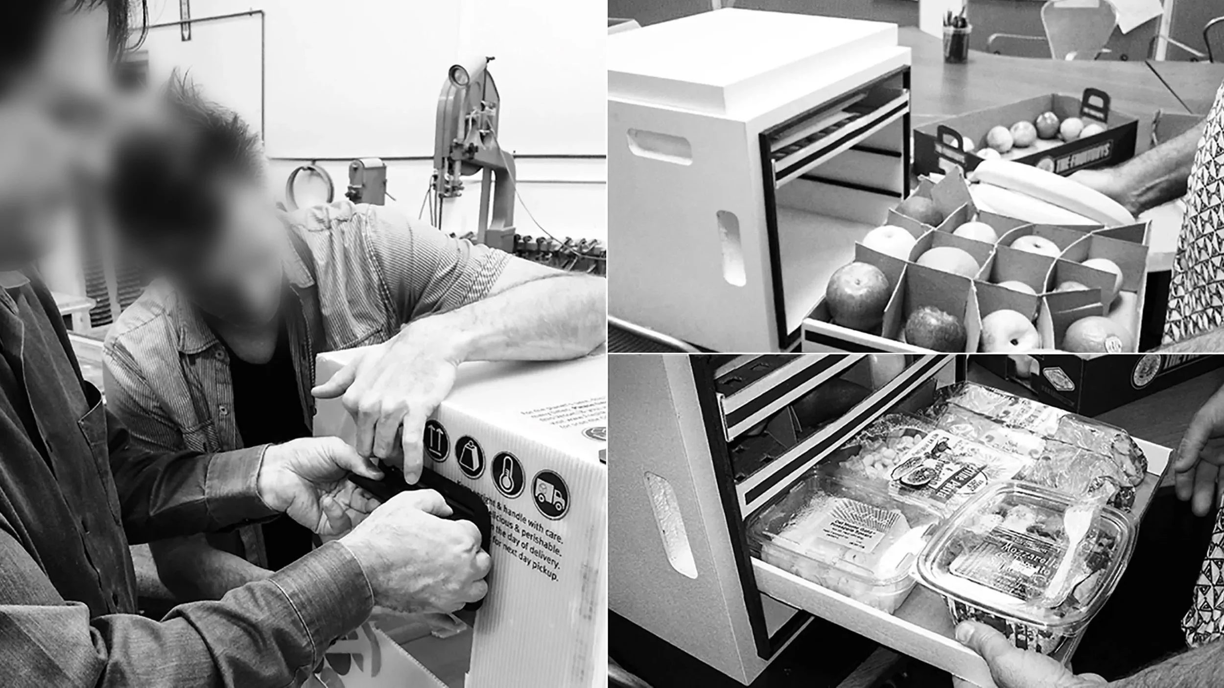
FreshRealm is a fresh food distribution company which, over the years has transitioned into a provider for brands and retailers ranging from Kroger and Amazon Fresh to it’s recent acquisiton of Blue Apron. Beginning in 2013, I worked as ID lead on several projects focused on direct to consumer grocery delivery – in particular a reusable fresh food shipping vessel.
This early incarnation of FreshRealm was focused on revamping the food distribution ecosystem to maximize freshness, reduce waste and streamline processes.
Their direct to consumer model included the development of a reusable shipping vessel. The vessel was designed to ship through traditional mail while passively maintaining refrigeration over 72 hours.
The size and shape of the vessel was optimized for usability as well as to maximize the shipping capacity. We did extensive mockups and testing to address all user touchpoints. One challenge in particular was the requirement for external handles and latches to maintain a nearly flat profile in order to be shippable through the mail system.
In addition to the drawer system, handles, tamper proof latches and seals, we also worked extensively to address the cold-chain challenges. Ultimately we arrived at a solution that integrated co-molded conductive aluminum into the drawers, which when combined with lego-brick like modular icepacks helped to distribute cooling evenly throughout the vessel.
Line 6 is a guitar and audio equipment manufacturer, best known for their pioneering work in digital amplifier modeling. I worked on several products for Line 6 while at RKS including their iOS accessory device Sonic Port as well as their first fully connected smart amps, AMPLIFi.
Line 6’s digital modeling allows users to emulate the tone created through dozens of different amps, cabs and effects pedals. Our initial design exploration focused on a variety of users for whom this all-in-one experience would be appealing – from cash-strapped beginners to lapsed experienced players.
The design exploration focused on several different form factors including a more traditional amp form as well as a premium model intended to better integrate into the home by blending consumer audio cues and guitar gear.
Though the premium version was later abandoned, the more traditional amp form factor was ultimately produced in a variety of form factors. The multifunction control knob (which featured more prominently in the abandoned design) was maintained in a simplified form in the production version.
Prior to AMPLIFi, I worked on Line 6’s iOS device the Sonic Port. Sold in the Apple store after launch, the design exploration focused on cable management for the numerous inputs and outputs that the device enabled. The final design featured a heavy ballast to keep the device in place and isolated the iOS connection to keep the connected device independent and accessible.
|
Line 6 AMPLIFi, Sonic Port
RKS, 2012 |
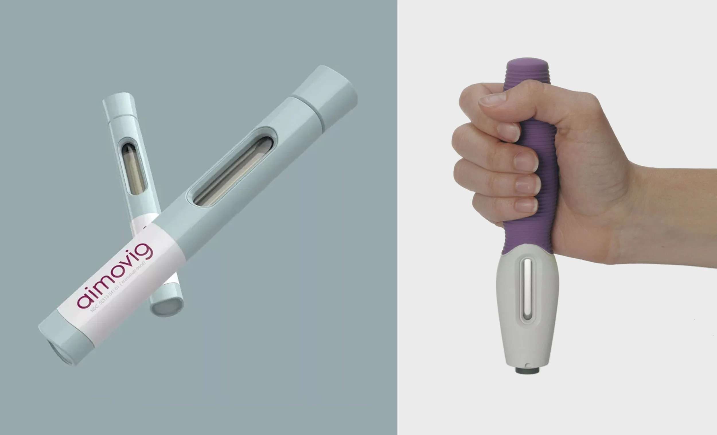
While at RKS, I worked as a designer and design lead on several autoinjector projects. In each case, these devices were tailor made for a specific medication and intended to be self administered by patients in a home/non-clinical setting.
One device was designed for a forthcoming osteoporosis treatment. This required special consideration for the physical, emotional and cognitive states that it’s mostly older, female user group may experience.
Initial primary and secondary research was conducted and distilled into various personas and patient journeys. Notable areas for improvement included device stability and grip, visual and other feedback and clear communication of device orientation and functionality.
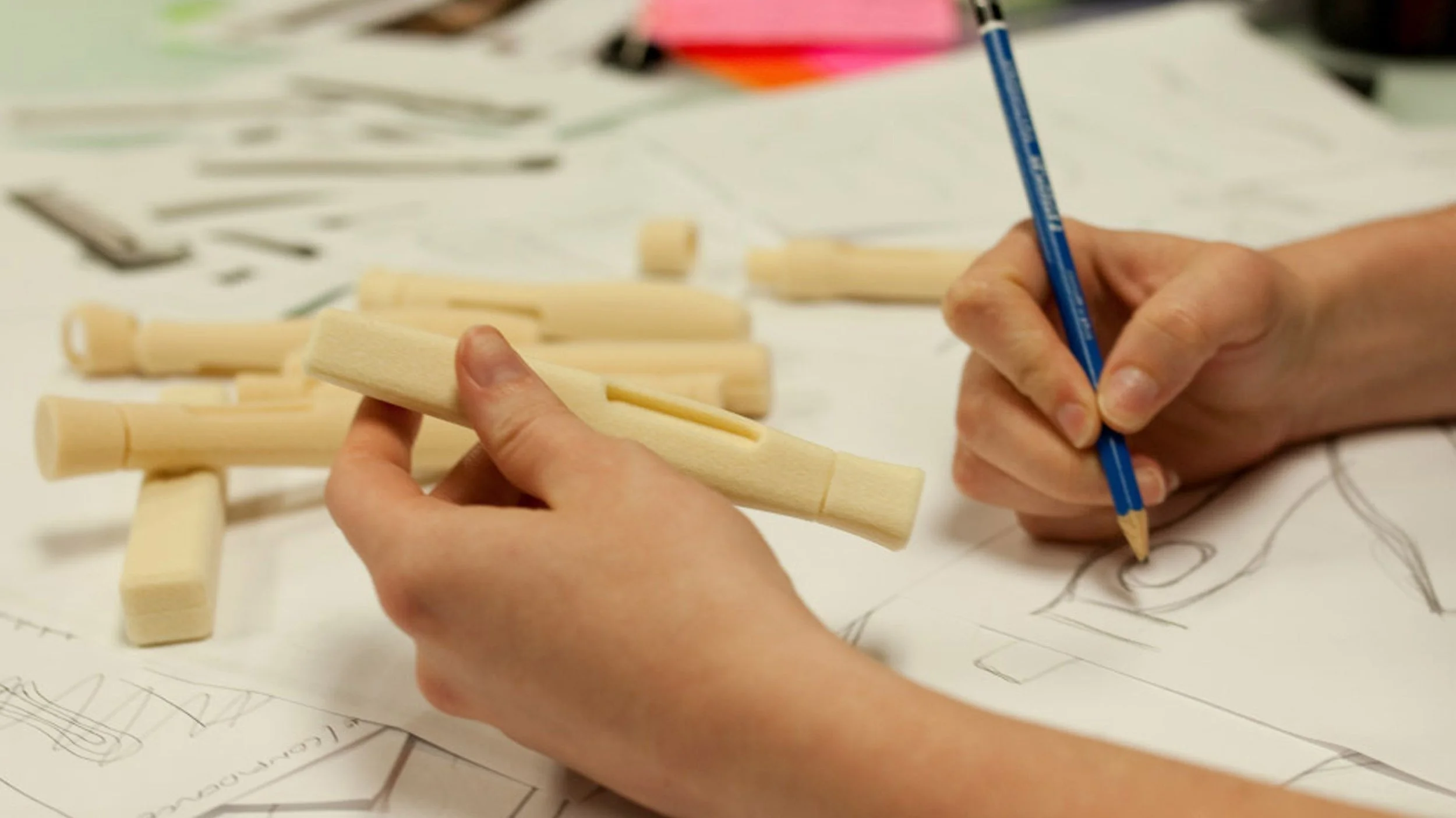
Extensive form development on several different themes was conducted, including dozens of models in varying fidelities, including appearance models for consumer testing.
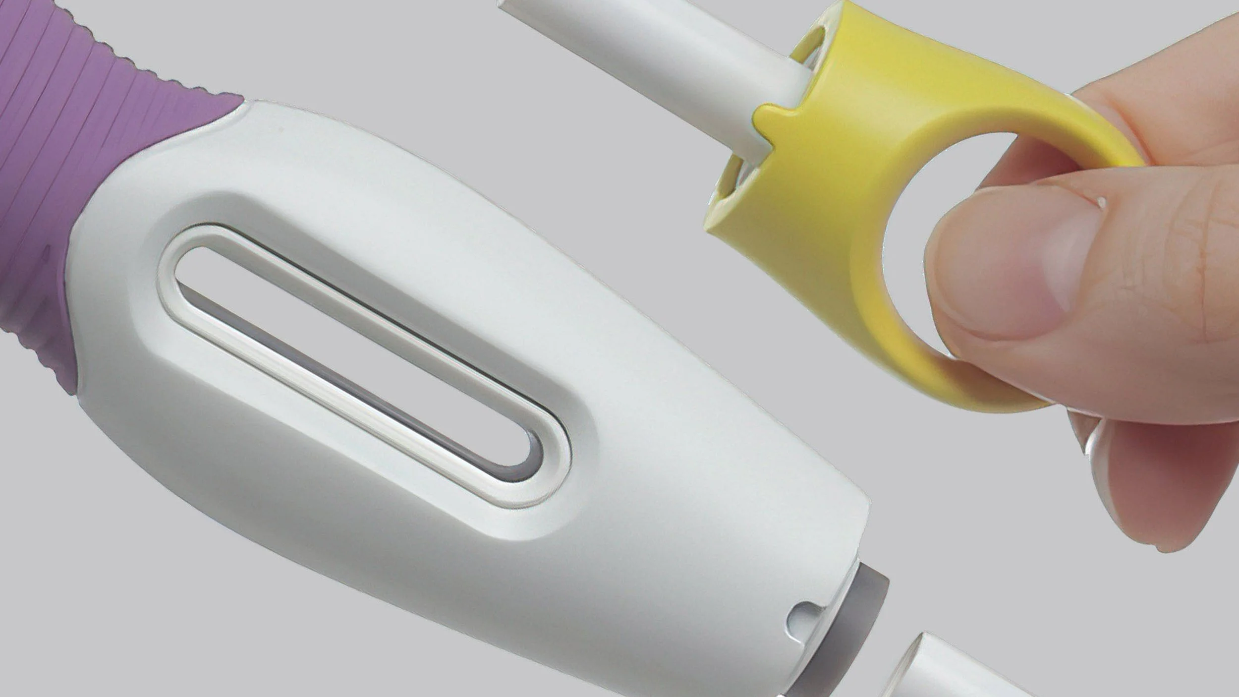
After several rounds of patient feedback and refinement, the final design was completed, and featured an affirming grip with a subtle ‘hilt-like’ feature, an emphasized window for medication inspection, an easily identifiable and removable cap and pressure actuation. The project would later be awarded by our client with a top internal award across all business units and ventures.
In addition to the osteoporosis treatment, a separate program for a migraine treatment device was also completed. With a very different user group in mind that lacked some of the dexterity challenges of the older osteoporsis group, the design exploration focused on psychological comfort and affirmation.
|
Autoinjectors
RKS, 2013 |
During my tenure at Western Digital, the company acquired Hitachi’s storage division including their cult consumer brand, G Technology. I worked to help define the evolution for the brand and on it’s next iteration of products.
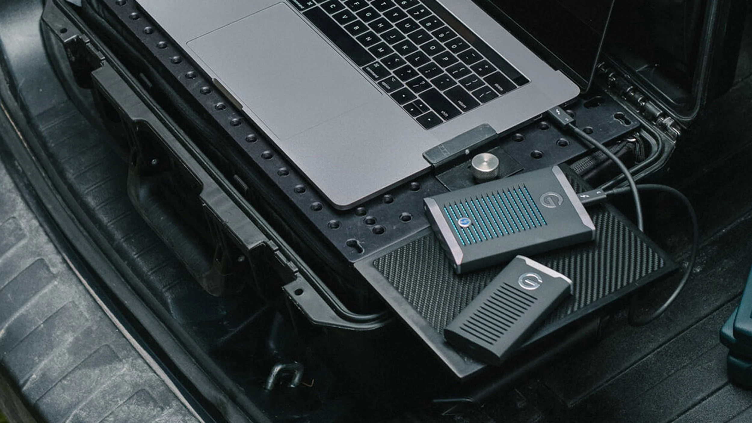
Due to G Technology’s early association with the Mac ecosystem, their products found extensive use in professional and prosumer applications – particularly in the film industry. The heritage ID was largely derivative of early Apple design, though executed with less precision and refinement.
Aero was influenced initially by G Tech’s heritage elements, including it’s use of extruded forms and ‘Superhero’ branding while also intending a more unique expression that emphasized speed and performance.
The initial aero products, including the G Drive Mobile SSD featured a subtly visible anodized extruded heat sink with a soft touch molded cover that mimicked G Tech’s earlier use of extruded forms. This was combined with a more dynamic profile and notch element to emphasize directionality
|
G Technology Aero
WD, 2017 |
Hamilton’s Cuff Pressure Monitor is a medical device intended to be used alongside ventilators to provide better control of the patient’s tracheal cuff, ultimately reducing the incidence of ventilator associated pneumonia.
The design exploration included several configurations for form factors and input methods; ultimately a vertical configuration with haptic buttons and a digital display was selected.
The design for the Cuff Pressure Monitor focused on the digital display and user IO’s. Importantly, patient status (particularly in emergencies) would need to be instantly communicated to health care providers and controls needed to be optimized to reduced potential errors.
In order to help address the variety of settings that the Intellicuff would be used in, a universal mounting system was also developed to attach to a number of rails and other devices.
|
Intellicuff Cuff Pressure Monitor
RKS, 2013 |
| Research & Strategy |
|
Google Sanctuary
WHOA, 2019
Through a series of long-form ethnographic and co-creative sessions across the US, we sought to help Google understand what makes people regard their homes as a sanctuary. Our deliverable included hundreds of pages of insights, 30 minutes of edited documentary film, and a strategic framework around smart home technology with design recommendations that better help people achieve a sense of sanctuary in their lives. |

|
Netflix UX Audit & Strategy
WHOA, 2020
During the height of the pandemic, we helped Netflix to better understand the communication needs of its viewers. Respondents were provided with a series of remote activities, which combined with co-creative Zoom sessions and a complete UX audit of the mobile and TV Netflix apps yielded a situational communication framework that helped identify that type of communication that should be employed for different viewing scenarios.
|

|
Samsung MEA TV CX
RKS, 2014
In an earlier impactful project, I was part of the design and research team in a project aimed at developing low-cost CX innovations for Samsung's TV, localized for the Middle East and Africa. As part of the program we generated dozens of concepts – I supported research and concept testing in Saudi Arabia and Jordan. |


|
Samsung Live Betas
WHOA, 2019
Over the course of a month, we ran a live beta for Samsung for a combination service, app and wearable that helped reward users with insurance benefits for maintaining an active lifestyle. In addition to helping Samsung identify areas for improvement in the digital experiences, we also helped them better understand the consumer response to the core service's value proposition. |
|
Food Service Strategy
WHOA, 2019
Working with Wismettac – one of the largest Japanese food suppliers – we helped explore the changing consumer and food service landscape. This included extensive site visits and interviews with a variety of restaurateurs and other food service/infrastructure professionals, from Michelin rated chefs to backyard caterers.
|

|
Infusion HCP Experience
WHOA, 2019
We helped a major drug company explore why a legacy infusion treatment for cancer was losing market share. Through a series of interviews with various healthcare professionals and an extensive journey mapping exercise we helped identify a number of practical solutions (right-sizing the package size, for example) to help them regain market share. |

|
About Me
Hello, I’m Greg. Thank you for taking a look at my work. Most recently I worked at Amazon in the Just-Walk-Out technology team on new-to-world shopping experiences; previously I led ID for new projects in Amazon’s Grand Challenge – a mission driven internal startup organization. Prior to that, I co-founded an innovation consulting company that worked with clients including Google, Netflix and Ford and startups in categories including med tech and VR. I also spent time as a designer and lead at Western Digital and RKS Design where I worked on a large variety of challenges across a number of categories, including on products with production runs in the millions. All this to say, I consistently deliver results and am comfortable operating with demanding timelines and other project constraints; I excel at breaking down complexities and making creation a repeatable process while championing the customer experience and design within an organization. |


